Bold and subtle

I recall my painting teacher during my sophomore year in college who told me to never use black in my paintings, to never mix it with other colors.
Now that’s exactly what I am doing and experimenting with. “Rules are meant to be broken”, that was something another teacher said during the same year…
•
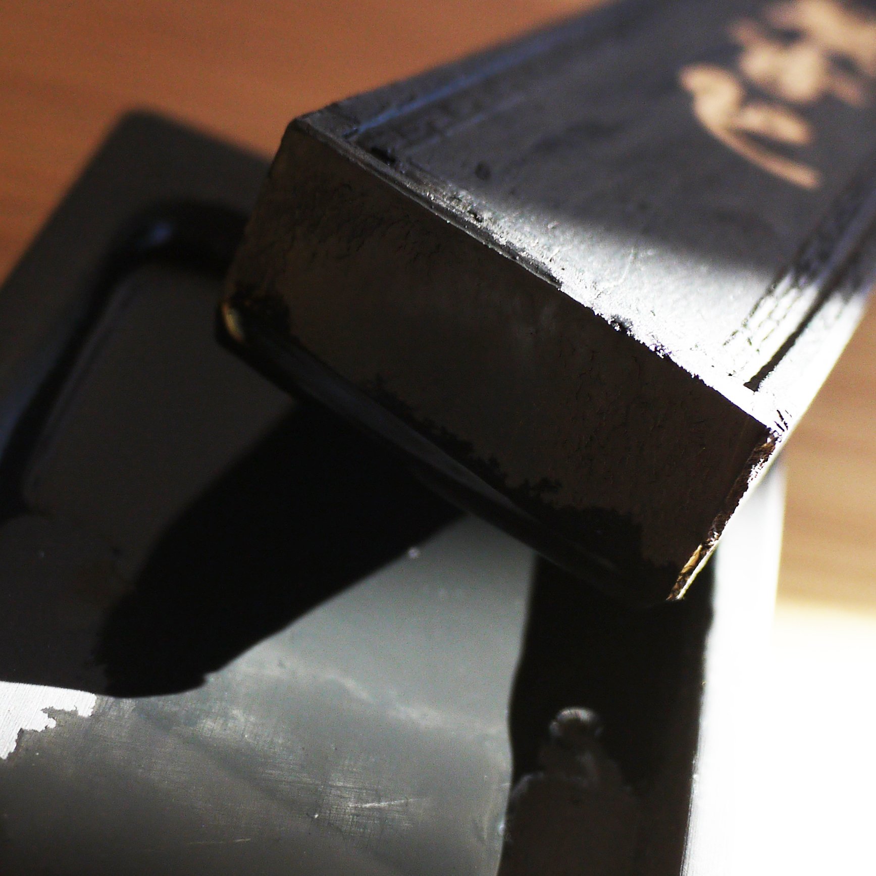
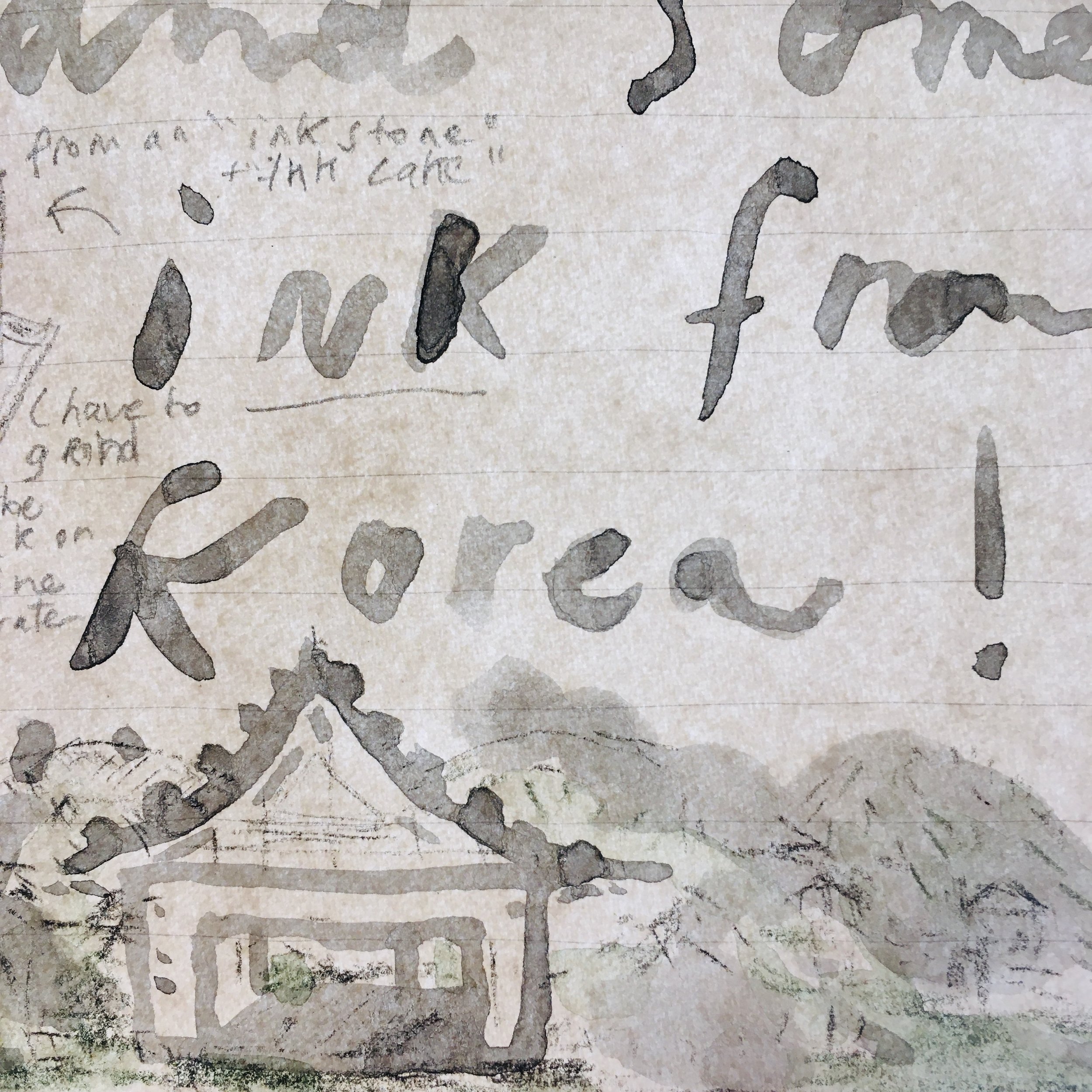
I bought an ink stone and ink cake during my recent stay in Gwangju’s “art street” where a number of art supply stores, calligraphy shops and galleries are concentrated on a few blocks. The young shopkeeper insisted that I get the cheaper options, warning me with a smile that the other items “are very expensive!”. His boss was watching us from a distance. Both could barely speak English and I had to use Google Translate on my phone together with hand gestures and rudimentary sketches on my notepad to explain what I was looking for. Most of the goods he sold were made in China except for some of the paper and brushes (from Korea) and watercolors from Japan. I was slightly amused by his advice to buy cheap but I took anyway and opted for an ink that cost me barely $5 together with an ink stone that was even cheaper.

Since my return to France, I have been enjoying the texture and weight of this material. It feels raw and real.
I pour some water first in the stone and then dissolve the ink by grinding it on the watery surface. A pool of black ink slowly forms throughout the process, however it is impossible for me to know at first how dark the ink will be. My first attempts delivered a watery grey, then gradually, I reached a darker tone. I used this first production to write an illustrated letter to a friend, layering the greys and blacks.
I followed later on with some watercolor drawings, where I mixed pastel hues against the weight of the black/grey tones. The balance seemed at first difficult to reach, the black being too heavy and overpowering. Eventually, with trials and errors, I found an in-between that seems to work, adding and layering color tones to the black: blues, purples especially. That’s how the black starts to communicate with the rest of the colors, as it blends in and diffuses its boldness throughout while remaining subtle nonetheless.
